Animated HR Diagram
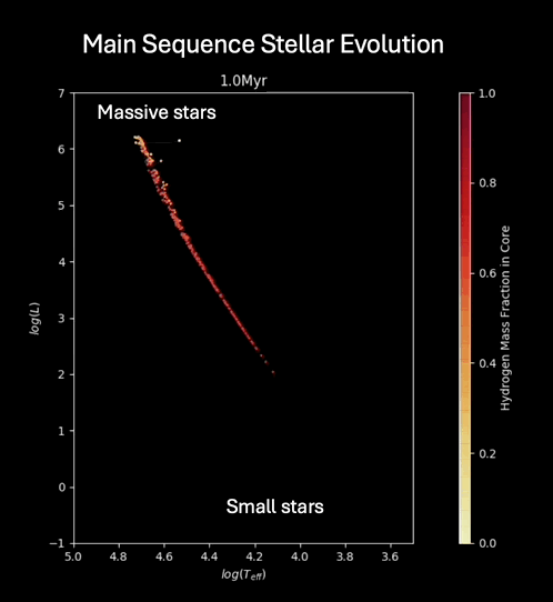
The Hertzsprung–Russell diagram (HR Diagram) shows the status of stars in a cluster, represented by points for each star defined by temperature or color on the x-axis and luminosity (energy production) on the y-axis. From a cloud of gas, most of the stars in a cluster will form around the same time and constitute a population of stars of different mass but roughly the same age. According to their mass, the stars will then move around. Brighter and hotter stars are on the top left.

I remember profs and books trying to animate this plot with words and isochrones and arrows - and it was not quite as effective as just animating the diagrams. The main ideas are that massive stars have short lifetimes, and low mass stars have very long lifetimes. The difference in lifetimes, as well as the interactions between stars and gas cloud results in the observed stellar mass distributions and populations. The static diagonal structure of the diagram is called the Main Sequence, which is where most stars spend most of their time as observable objects. Someone could extend this animation to include the entire lifecycle from main sequence through red giant, post-red giant, and to super nova or white dwarf stages.
The animation goes through 100s of millions of years, and when we look at a cluster of stars, we only see a snapshot in time. Looking at a snapshot, we can construct a line between the nearest points called an isochrone. The line connects stars that have the same age, but different mass. The shape of the isochrone can tell us the age of the cluster.